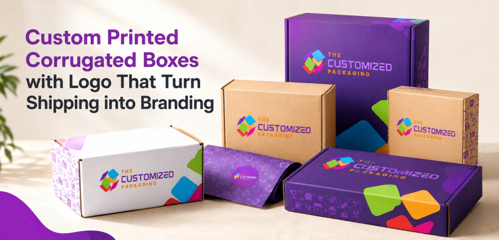
Custom Printed Corrugated Boxes with Logo: What to Print and Where to Place It
A corrugated shipping box is taped, labeled, stacked and handled before the customer sees it. Learn where to place your logo, shipping label, barcode, QR code and supporting artwork so the finished package still looks clear and recognizable after packing and delivery.
 Published June 22, 2026
Updated September 01, 2026
15 min read
A corrugated shipping box rarely reaches the customer looking exactly like the artwork proof.
Before delivery, it may be folded, taped, labeled, stacked, scanned, moved through fulfillment equipment and handled multiple times. A shipping label can cover part of the top panel. Tape may run directly through the center of a logo. Fold lines can distort text. Barcodes and QR codes need clear, readable areas.
That is why successful custom printed corrugated boxes with logo should be designed around the real shipping package rather than the flat dieline alone.
The objective is not simply to put a logo on a box. It is to decide which information belongs on each panel, reserve space for carrier labels and tape, protect important artwork from folds and edges, and make sure the branding remains recognizable after the order has been packed.
Start With the Finished Shipping Box
Before positioning any artwork, determine how the box will actually leave the warehouse.
Ask how it will be:
packed → closed → taped or sealed → labeled → stacked → shipped → opened
Those steps determine which areas remain useful for branding.
A large blank top panel may look like the obvious location for a logo until a 4 × 6 shipping label is placed over it.
A centered design may look balanced until packing tape runs directly through the middle.
Artwork near an edge may look fine on the dieline but move around a corner after the box is folded.
For custom printed corrugated shipping boxes, artwork planning should therefore begin with the assembled and labeled carton.
Give Every Printed Surface a Job
Not every panel needs the same message.
A clearer system assigns information according to where and when it will be seen.
| Box Area | Useful Content |
|---|---|
| Main customer-facing panel | Logo and primary brand recognition |
| Secondary side panel | Website, short message or product identification |
| Shipping-label area | Reserved mostly for carrier documentation |
| Opposite side panel | Handling information, SKU or supporting branding |
| Interior lid on mailers | Thank-you message, QR code or instructions |
| Bottom panel | Less important operational or disposal information |
| Closing flap | Small brand mark or opening instruction |
| Interior insert | Product identification or short instructions |
This creates hierarchy instead of covering every surface with marketing copy.
Decide Which Panel Is Really Your Main Branding Panel
The top is not automatically the best location.
The correct logo position depends on the box style and fulfillment process.
For a regular slotted shipping carton, large top flaps may be crossed by sealing tape and shipping documentation.
A side panel may therefore provide more consistent logo visibility.
For a corrugated mailer, the lid may remain relatively clean and become a stronger customer-facing area.
For vertically stacked cartons, side branding may be more visible in storage and fulfillment than top-panel artwork.
Before choosing the logo position, view the package in the same orientation customers and fulfillment teams will see it.
Reserve a Shipping-Label Zone Before Designing the Artwork
One of the most practical improvements to branded corrugated boxes is simply leaving enough room for the shipping label.
Do not finish the graphics first and hope warehouse staff find an empty area later.
Instead, define a label zone on the dieline.
It should be large enough for the carrier label used in your fulfillment process and positioned on a reasonably flat surface.
Important branding should stay outside that area.
This helps prevent situations where the final shipment reaches the customer with the bakery name, skincare logo, clothing brand or ecommerce message partially hidden underneath carrier documentation.
The printed proof should be reviewed with a sample shipping label placed on it.
Plan Around Packing Tape
Tape is another element frequently missing from packaging mockups.
If the carton requires a center tape seam, identify that line before positioning the logo.
Avoid placing small text, QR codes or important visual details directly underneath it.
A large logo may be able to tolerate a seam crossing an open part of the design, but critical lettering should remain clear.
Branded tape can also become part of the visual system, but it should complement rather than obscure the printed box.
The final question is not:
Does the artwork look centered?
It is:
Does the artwork still look intentional after the box is sealed?
Keep Important Information Away From Folds and Scores
Corrugated cartons contain folds, scores, flaps and locking areas that can affect printing after assembly.
Important information should have sufficient distance from those structural areas.
This is particularly important for:
-
Small text
-
Web addresses
-
QR codes
-
Barcodes
-
Product codes
-
Fine logo details
Artwork can intentionally wrap around a corner, but that should be a deliberate design choice.
Do not allow a fold to cut through important information simply because the flat artwork looked balanced.
Allow for Normal Shipping Wear
A shipping carton is transportation packaging.
Corners and exposed surfaces may experience rubbing and handling before delivery.
Design the branding with that environment in mind.
Fine details positioned very close to corners may be less dependable than artwork placed within safer central areas.
Large areas of dark or highly detailed printing should also be evaluated on a physical sample because handling marks may affect some designs more visibly than others.
This does not mean corrugated shipping packaging needs to look plain.
It means the artwork should anticipate real-world handling.
Use Logo Size for Recognition, Not Maximum Coverage
A larger logo does not automatically create stronger branding.
An oversized mark can dominate the carton and become difficult to view when the package is held close to the customer.
A very small logo can disappear among shipping labels and handling marks.
For corrugated boxes with logo, choose a size that remains recognizable from a normal viewing distance while leaving enough surrounding space for the rest of the shipping system.
Logo proportions should also remain consistent across different box sizes.
The artwork does not need to use exactly the same physical logo dimensions on every carton, but customers should recognize the same visual system.
Build a Logo Safe Zone
A useful packaging artwork system establishes a clear area around the main logo.
Keep carrier labels, QR codes, barcodes, handling symbols and other competing information outside this zone where possible.
The logo safe zone provides visual separation.
It also makes the branding more resilient if warehouse labels or additional documentation must later be added to the package.
This becomes particularly important for ecommerce companies using several fulfillment partners because label placement may not always be identical.
Kraft and White Corrugated Board Affect Branding Differently
The printing surface becomes part of the artwork.
Natural kraft corrugated board has its own brown tone. Printed colors may therefore appear different from the same artwork viewed on a white screen or white paper.
Simple, high-contrast artwork can work effectively on kraft.
White corrugated surfaces provide a brighter base for colors, graphics and detailed artwork.
The choice should be based on the intended visual system rather than assuming one material automatically looks more premium.
For custom printed corrugated boxes with logo, test the artwork on the actual proposed surface before approving production.
One-Color Printing Can Be Enough
A branded shipping carton does not need full-color graphics to be recognizable.
A strong one-color logo can work particularly well when the design is:
simple, bold and easy to identify.
This approach can suit kraft shipping cartons, wholesale shipments, industrial products and ecommerce brands that want restrained exterior branding.
What matters is consistency.
A clear logo positioned correctly may communicate the brand more effectively than complex artwork competing with tape, labels and warehouse markings.
Use Full-Color Printing When the Graphics Need It
More detailed artwork may require a broader color range.
That can be useful when the package includes:
-
Illustration
-
Multiple brand colors
-
Product photography
-
Detailed patterns
-
Campaign graphics
However, full-color printing should still follow the same shipping rules.
Do not use extra printable space simply because it is available.
Carrier labels still require room. Tape still crosses certain panels. Folds still affect artwork.
The shipping function of the box does not disappear because the printing becomes more sophisticated.
Exterior Branding and Interior Branding Have Different Jobs
Exterior printing is visible before opening.
Interior printing is revealed afterward.
Those surfaces do not need to repeat exactly the same message.
The outside of a shipping box may prioritize:
brand identification + handling clarity
while the inside may contain:
customer message + instructions + reorder path
For a corrugated mailer, the inside lid can provide a useful location for information that would clutter the shipping exterior.
The exterior can remain restrained while the interior carries more visual personality.
Some Brands May Prefer Discreet Exterior Packaging
Highly visible branding is not appropriate for every shipment.
Depending on the product, customer expectations or brand positioning, a company may prefer a relatively neutral exterior.
In that situation, the outside can use a small logo or limited printing while more branding appears inside.
That is still custom printed corrugated packaging.
The objective should be to match the package to the delivery experience rather than assuming every box needs maximum exterior visibility.
Keep Barcodes Separate From Decorative Artwork
Warehouse and product barcodes need clear printing areas.
Do not position them over:
patterns, folds, seams or highly decorative backgrounds.
Operational identification should remain easy for the intended scanning process.
If the package also carries a product SKU, lot reference or warehouse code, group those elements logically rather than scattering them among branding.
The side or lower panel can often provide a useful operational area while the primary customer-facing surface remains visually cleaner.
QR Codes Need a Specific Purpose
A QR code should not be added simply because the box can be printed.
Choose the destination first.
For a shipped product, useful destinations may include:
product setup → care instructions → reorder page → customer support → registration → collection information
Then choose the location.
An interior panel may be better for information intended for the customer after opening, while an exterior code may be useful for logistics or another appropriate pre-opening purpose.
The printed code should have enough clear space around it and should be tested on the final package.
Separate Customer QR Codes From Operational Codes
A package may contain several machine-readable elements.
Customers should not have to guess which one they should scan.
If the shipping carrier label already contains multiple barcodes, placing another customer-facing QR code immediately beside them can create visual confusion.
A better approach is to position the customer code in a clearly branded area with a short explanation of what it does.
For example:
Scan for setup instructions
is more useful than an unexplained square code.
Handling Information Should Not Compete With the Logo
Some corrugated shipments need orientation or handling communication.
Where applicable, these markings should remain clear and separate from decorative graphics.
Branding should never make important operational information harder to find.
Likewise, handling symbols should not be positioned randomly over the main artwork after the design is finished.
Plan both systems on the dieline at the same time.
Design Regular Shipping Cartons Differently From Mailer Boxes
“Corrugated box” describes a material family, not one single structure.
A regular slotted carton and a roll-end mailer interact with artwork differently.
| Structure | Branding Priority |
|---|---|
| Regular slotted carton | Side-panel visibility, tape path and shipping-label area |
| Corrugated mailer | Lid artwork, opening sequence and interior reveal |
| Full-overlap carton | Large overlapping flap and closure planning |
| Product shipper | Product identification plus delivery information |
| Subscription mailer | Repeatable exterior and interior brand system |
This is why simply copying the same artwork onto every corrugated structure can produce inconsistent results.
The design should follow the box construction.
Create a Consistent System Across Multiple Box Sizes
Growing ecommerce brands rarely use only one shipping carton.
You may need small, medium and large boxes for different orders.
The branding should look related across all three.
Establish rules for:
logo position → logo proportion → label zone → typography → side-panel information → QR-code location
Then adapt those rules to each dieline.
Do not independently redesign every box size.
Customers should be able to recognize the same brand regardless of which carton arrives.
Avoid Printing Temporary Information Permanently
Printed packaging can remain in inventory for months.
Before placing information directly on a large quantity of boxes, consider whether it is likely to change.
Be cautious with:
temporary promotions, short-term URLs, campaign dates, rapidly changing offers or product-specific details on boxes shared by several SKUs.
Variable information may be better handled with labels, inserts or digital destinations.
Permanent printing works best for information that is likely to remain useful throughout the life of the packaging inventory.
Make Return Information Easy to Find Where Relevant
If the same ecommerce box may be used for returns, the package should consider that journey too.
A customer may need instructions explaining:
how to prepare the product → where to find support → how to reseal the package
Those instructions do not necessarily belong on the exterior.
An interior panel or printed insert can provide a cleaner location.
The important point is to consider the complete lifecycle of the shipping box when deciding what deserves permanent print space.
Do Not Let Branding Reduce Product Protection
Artwork comes after structural performance.
The correct corrugated box still needs to account for the actual product, packed weight, dimensions, movement, stacking and shipping conditions.
Custom printing cannot correct:
an oversized carton, insufficient board strength, poor closure or an unsupported fragile product.
If the structure needs to change after testing, the artwork may also need adjustment.
Finalize the functional packaging system before locking the printed design.
Test the Box the Way It Will Actually Ship
A digital proof is only the beginning.
Before a larger printed production run, assemble a representative sample and reproduce the real packing process.
Add the product.
Add the intended insert or cushioning.
Close the box.
Apply the actual tape.
Place a sample carrier label in the planned position.
Add any warehouse labels.
Then evaluate the finished package from several angles.
The most important design problems often appear only after these practical elements have been added.
What to Check on the Printed Sample
Before approving custom printed corrugated boxes with logo, check the assembled package for logo visibility, shipping-label clearance, tape placement, fold interference, barcode readability, QR-code scanning, artwork alignment, color appearance, handling information and product fit.
Also inspect the package from the customer's likely viewing angles rather than only looking at the flat printed sheet.
If several sizes will use the same branding, place the finished samples together and confirm that they look like one packaging family.
Frequently Asked Questions About Custom Printed Corrugated Boxes with Logo
Where should a logo be printed on a corrugated shipping box?
The best location depends on the box style, tape path and shipping-label placement. A side panel can work well on regular shipping cartons, while the lid may be more useful on corrugated mailer boxes. Review the logo on the fully assembled and labeled package.
Can you print a logo directly on corrugated boxes?
Yes. Corrugated packaging can support logo printing and other branded artwork. The appropriate printing approach depends on the board surface, artwork detail, colors, quantity and required presentation.
Should the shipping label area be included in the box design?
Yes. Reserving a shipping-label zone helps keep carrier documentation from covering important branding or product information.
Can QR codes be printed on corrugated boxes?
Yes. QR codes can connect customers to instructions, support, reorder pages or other digital content. They should be printed with adequate contrast and clear surrounding space and tested on the finished box.
Should a logo go on the top or side of a shipping box?
Either can work. The decision should follow the box structure and fulfillment process. If the top is crossed by tape or commonly covered by a shipping label, a side panel may provide better visibility.
Is kraft corrugated suitable for logo printing?
Yes. Kraft provides a natural brown printing surface and can work particularly well with strong, high-contrast artwork. Colors should be evaluated on the actual kraft material because the substrate affects their appearance.
Do branded shipping boxes need full-color printing?
No. One-color or limited-color artwork can create strong brand recognition when the logo and design are clear. Full-color printing is useful when the artwork actually requires additional detail or colors.
Should interior and exterior printing use the same design?
Not necessarily. Exterior printing can focus on identification and shipping, while interior printing can carry customer messaging, instructions, QR codes or a different part of the brand experience.
How should artwork be tested before ordering printed corrugated boxes?
Review a finished sample with the actual product, closure method, tape, shipping label and other fulfillment markings in place. Test important printed codes and inspect the artwork after the box is completely assembled.
Design the Branding Around the Shipment
The strongest custom printed corrugated boxes with logo are not designed as flat advertising canvases.
They are designed as shipping packages.
Logo placement accounts for carrier labels. Artwork avoids tape paths and critical folds. Barcodes and QR codes have readable spaces. Exterior branding reflects how visible the shipment should be, while interior printing can handle customer information that does not belong outside.
Most importantly, the branding is evaluated after the carton has been packed and closed.
That is how a printed corrugated box can remain recognizable without interfering with the practical information required to move the order from the warehouse to the customer.
The Customized Packaging develops custom printed corrugated boxes with logo around your box dimensions, structure, artwork and shipping requirements. Share your box size, product details, quantity and branding to create printed corrugated packaging that works as a finished shipment—not just on a dieline.