Kraft Face Primer Boxes: How Kraft Affects Printing, Color and Cosmetic Presentation
Kraft stock changes how face primer packaging looks before a single design element is added. Learn how its natural surface affects printed colors, white ink, logos, typography, finishes and the overall presentation of cosmetic primers.
 Published June 02, 2026
Updated September 04, 2026
14 min read
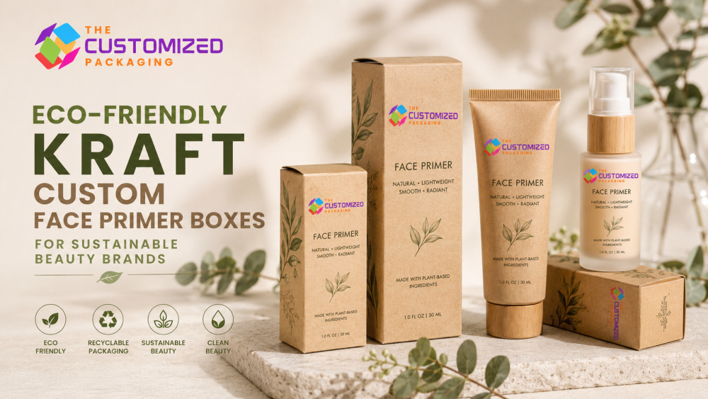
Kraft face primer boxes have a noticeably different visual character from white paperboard cosmetic packaging. The natural brown surface becomes part of the design, influencing printed colors, logo contrast, typography, finishes and the overall appearance of the packaged primer.
Unlike general custom face primer boxes, choosing kraft requires additional attention to how artwork behaves on a naturally colored substrate. A pale pink, beige or pastel graphic created for white paperboard may produce a different result when printed directly onto kraft.
That makes kraft more than a visual preference. The material, printing method and artwork should be planned together so the finished carton looks intentional and remains easy to read.
What Makes Kraft Face Primer Boxes Different?
White paperboard gives artwork a relatively neutral background. Natural kraft already has its own brown tone, visible fibers and paper texture.
That underlying surface influences the finished appearance before ink or finishing is applied.
Depending on the stock, kraft can range from lighter natural brown to deeper shades. Surface smoothness can also vary. These characteristics can make packaging appear minimal, tactile, understated or more natural in appearance.
For face primers, the material should complement the product and brand rather than dictate the entire design.
A hydrating primer, mattifying primer, illuminating primer and smoothing primer can all use kraft cartons while maintaining clearly different identities through typography, color accents and artwork.
How Printed Colors Change on Kraft
Color is one of the most important considerations when designing kraft face primer boxes.
The brown substrate can influence inks printed directly over it, particularly lighter shades. Colors that appear bright against white paperboard may appear warmer, darker or more muted against natural kraft.
This is particularly relevant to beauty brands using pale pinks, creams, beige, soft greens, light blues and other subtle cosmetic palettes.
Darker colors generally create stronger visual contrast, but the final appearance still depends on the selected kraft stock, ink and printing process.
For artwork where color accuracy is important, evaluate a printed sample rather than relying exclusively on a digital screen.
When White Ink Helps on Kraft
White ink can change what is possible with kraft packaging.
Instead of allowing the natural brown surface to influence every design element, white can be used selectively as a visible color or as a foundation beneath other printed colors.
White as a Design Color
White logos, product names and graphics can create clear contrast against natural kraft.
A kraft carton using white typography with one carefully selected accent color can create a clean beauty presentation without hiding the paper surface.
White as an Underbase
White can also be printed beneath selected colors.
This separates those colors from the brown substrate and can help lighter artwork appear closer to the intended result.
It does not mean the entire box needs white coverage. Strategic white ink can preserve the kraft appearance while improving important graphics, product names or color accents.
Black Printing Creates Strong Contrast
Black is a natural pairing with kraft because it usually provides clear visual separation from the brown surface.
Black logos, line artwork and typography can create a restrained design without requiring heavy ink coverage.
This combination can suit skincare-inspired primers, professional cosmetic lines and brands using a minimalist identity.
Simple does not mean incomplete, however.
The front panel still needs a clear hierarchy so customers can quickly identify the brand, product and primer type.
Make the Logo Readable at Actual Size
A logo that appears perfectly clear on a large monitor may behave differently when reduced to the dimensions of a small face primer carton.
Fine lines can become less visible. Small lettering can become difficult to read. Low-contrast colors can blend into the kraft background.
Evaluate the logo at its actual printed dimensions.
Check:
-
logo size;
-
line thickness;
-
lettering size;
-
contrast against kraft;
-
clear space around the logo; and
-
interaction with nearby product information.
The goal is not necessarily to make the logo larger. It is to make it recognizable.
Typography Needs Enough Contrast
Face primer packaging often needs to communicate more information than the front panel can comfortably hold.
The front can prioritize the brand name, product name, primer type and key identification details. Side and back panels can organize additional information.
Avoid using extremely subtle text colors simply because they look elegant on a design screen.
Small beige, tan or muted-gray text can lose readability against natural kraft.
Strong contrast becomes particularly important for smaller text, barcodes and other information customers need to read easily.
Kraft Does Not Have to Look Rustic
Using kraft does not automatically mean the finished carton needs a handmade or rustic aesthetic.
Artwork can take the material in several directions.
A face primer carton can use:
-
black and kraft for a minimalist appearance;
-
white and kraft for stronger contrast;
-
limited color accents for formula identification;
-
metallic details for a more decorative presentation;
-
botanical illustrations;
-
modern typography; or
-
restrained premium finishing.
The substrate provides the background. Typography, artwork and finishing establish the broader brand personality.
Build a Clear System for Multiple Primer Formulas
Beauty brands frequently sell several primers within one collection.
Hydrating, mattifying, smoothing, illuminating and color-correcting formulas may share the same brand identity but need to remain easy to distinguish.
Kraft can act as the consistent visual foundation while selected design elements change between products.
For example, every carton might use the same logo position and typography while a color band changes according to the formula.
A simple system could use:
-
blue for hydrating;
-
neutral gray for mattifying;
-
warm gold for illuminating; and
-
another defined accent for smoothing.
These are design examples rather than fixed rules. The colors should follow the brand's established visual system.
The important point is consistency: customers should recognize the collection while still being able to distinguish individual products.
Design Artwork on the Actual Dieline
Artwork for kraft face primer boxes should be developed around the final carton structure.
A flat rectangular design does not show where folds, seams, closures and flaps will appear after assembly.
Important logos and text should stay clear of areas where construction can interrupt readability.
The dieline also shows how adjacent panels meet.
This matters when artwork intentionally continues from the front panel onto the side or when a background graphic wraps around the carton.
Designing directly on the production dieline helps prevent important visual elements from landing in awkward positions.
Use the Front Panel for Fast Product Recognition
The front of a face primer box has limited space, particularly for narrow cartons.
Avoid making every piece of information compete for equal attention.
A useful hierarchy may be:
-
Brand
-
Product name
-
Primer type
-
Important formula or finish identifier
-
Net quantity where applicable
Supporting information can move to the side and back panels.
This gives the customer a clearer first view while preserving enough space for detailed product information elsewhere.
Match the Artwork to the Primer Container
The primary container affects the proportions of the kraft carton and therefore the available artwork space.
A squeeze tube may require a narrow vertical carton. A pump or airless dispenser may create a taller format. A jar can produce a shorter and wider package.
Rather than treating each of these as separate packaging topics, use the container dimensions to guide the artwork layout.
A narrow panel may need compact typography. A broader carton can support a larger logo or additional front-facing information.
If the product requires a substantially heavier presentation structure rather than a folding carton, rigid face primer boxes represent a different packaging approach and should be evaluated separately.
Use Finishes With a Clear Purpose
Kraft face primer boxes can incorporate decorative finishing, depending on the selected material and production method.
Possible treatments may include foil stamping, embossing, debossing or selected coatings.
The strongest design does not necessarily use the most finishes.
A small metallic logo can create contrast against natural kraft. Embossing or debossing can add tactile detail without covering the paper with additional color.
Before selecting a finish, ask what it contributes.
Does it make the logo more recognizable? Does it support the intended positioning? Does it improve hierarchy?
If it does not solve a visual or presentation need, it may not be necessary.
Coatings Can Change the Natural Kraft Appearance
The coating decision can affect both the appearance and feel of kraft.
An uncoated surface generally retains more of the paper's natural texture. Other treatments can alter smoothness, sheen and the way printed artwork appears.
This matters when the kraft surface itself is an important part of the design.
If a brand chooses kraft because it wants a visible paper texture, applying a finish that substantially changes that character may work against the original design objective.
Evaluate the finished combination rather than selecting the stock and coating independently.
Should a Kraft Primer Box Have a Window?
A die-cut window can reveal part of the primary face primer container.
Whether that is useful depends on what the customer gains by seeing the product.
If the tube, bottle or jar has an important color, label or decorative feature, visibility may support the presentation. If the outer carton already communicates everything clearly, a window may provide little additional benefit.
Position is equally important.
The opening should align with the part of the primary container that customers are intended to see.
Brands specifically considering product visibility should evaluate window face primer boxes as a separate structural approach rather than adding a window without considering the container position and carton strength.
Keep Formula Variants Easy to Identify
Kraft creates a strong common background, which makes a controlled variant system especially useful.
Different primers can be identified using color accents, product names, symbols, numbers or other consistent visual devices.
The difference needs to be noticeable enough to help customers.
If every SKU uses nearly identical brown packaging with only a tiny change in text, products may become unnecessarily difficult to distinguish on a shelf or ecommerce image.
Consistency and differentiation should work together.
Plan Side and Back Panels Carefully
The front panel does not need to carry every message.
Side and back panels can provide space for ingredients, directions, company information, barcodes, batch information, warnings and other product details as appropriate.
A QR code can also connect the physical carton to additional product information, application guidance or the brand website.
The available space should be planned before artwork becomes crowded.
Good face primer packaging makes the product easy to recognize while keeping supporting information organized and readable.
Consider How Kraft Appears in Ecommerce Photography
Natural kraft can appear differently under different lighting conditions.
Warm lighting can make the carton look more orange or yellow, while cooler lighting can change its perceived tone.
This matters when a cosmetic product is sold online.
Product photography should represent the actual kraft shade reasonably accurately so the physical package does not look substantially different from the customer's expectation.
Consistent lighting is particularly important when several kraft-packaged products are photographed together as a collection.
Kraft Appearance Is Not an Environmental Guarantee
A natural brown carton can visually suggest simplicity, but appearance alone does not establish the environmental characteristics of the finished package.
The complete construction may include ink, adhesives, coatings, laminations, windows, foil, labels or inserts.
These components matter when evaluating or describing characteristics such as recycled content or recyclability.
For that reason, avoid assuming that a kraft face primer box can automatically be described as “eco-friendly,” “sustainable,” “100% recyclable,” “biodegradable” or “compostable.”
Use specific environmental information only when it accurately describes the finished packaging and can be supported by the relevant material specifications.
Recycled Content Is a Material Specification
Natural kraft appearance and recycled content are not the same thing.
If recycled content is important to a packaging project, confirm the actual material specification rather than relying on the carton color.
The same principle works in reverse: packaging containing recycled fiber does not necessarily have to use a brown natural-kraft appearance.
Separating the material specification from the visual style allows the brand to make more accurate packaging decisions and communicate them more clearly.
Avoid Unnecessary Mixed Materials
When developing a kraft carton, consider whether every added component is actually required.
A window film, decorative sleeve, insert or additional laminated layer can change the construction of the finished package.
Sometimes these additions solve an important problem. Sometimes they are purely decorative.
Review each component according to its purpose.
A simpler carton can be the better design when the primary primer container already provides sufficient product protection and the secondary box mainly needs to provide branding, labeling space and presentation.
Printing Should Support the Product, Not Fight the Material
One common mistake with custom printed boxes is treating every substrate as though it were a white canvas.
Kraft has its own visual character.
Artwork designed specifically for that character generally produces a more intentional result than trying to hide it beneath excessive printing.
If the design requires a completely bright, neutral background with highly accurate pale colors across the entire carton, another paperboard may be more appropriate.
Kraft works best when its natural surface contributes something useful to the design.
Test the Actual Printed Package
Digital mockups are valuable for layout approval, but a physical sample provides information a screen cannot reproduce completely.
For kraft face primer boxes, review:
-
actual board shade;
-
paper texture;
-
printed color appearance;
-
white ink coverage;
-
logo contrast;
-
small-text readability;
-
foil or embossed details;
-
coating appearance;
-
panel alignment; and
-
overall presentation with the actual product.
View the sample under typical lighting and alongside other products in the collection.
If several formulas share the same packaging system, compare them together to confirm that each SKU remains easy to identify.
Questions to Ask Before Approving Kraft Face Primer Boxes
Before production, confirm:
-
Does kraft support the intended brand appearance?
-
Have important colors been evaluated on the actual stock?
-
Does the logo have enough contrast?
-
Is small typography readable?
-
Is white ink necessary for any part of the artwork?
-
Can customers distinguish different primer formulas?
-
Do the selected finishes complement the material?
-
Does the artwork align correctly with the dieline?
-
Are environmental statements specific and supportable?
-
Has a physical sample been evaluated?
These questions focus the approval process on the actual finished package rather than the digital artwork alone.
Frequently Asked Questions
Are kraft face primer boxes suitable for cosmetic products?
Yes. Kraft paperboard can be used for secondary cosmetic cartons when its structure, dimensions, printing and finishing suit the particular face primer product and primary container.
Do colors look different when printed on kraft?
They can. The natural brown substrate can influence the appearance of printed colors, particularly lighter shades. A printed sample can help evaluate the final result.
Can white ink be printed on kraft face primer boxes?
White ink can be used on suitable kraft packaging and may serve as visible artwork or an underbase beneath selected colors. The appropriate printing approach depends on the stock and production method.
Can kraft primer boxes use foil or embossing?
Depending on the selected material and production process, kraft cartons can incorporate treatments such as foil stamping, embossing or debossing.
Should every face primer box have an insert?
No. An insert should solve a specific positioning, presentation or protection requirement. A correctly sized folding carton may not require one.
Does kraft mean the finished box is recyclable?
Not automatically. Recyclability depends on the complete package construction and applicable collection and recycling conditions, not simply the brown appearance of kraft paperboard.
Can the same kraft carton design be used for several primer formulas?
Yes, particularly when the primary containers share the same dimensions. Brands can keep the structure and core design consistent while changing product names, accent colors or other SKU-specific artwork.
Create Kraft Face Primer Boxes Around Your Artwork
Kraft face primer boxes can provide a distinctive cosmetic presentation when the artwork is designed specifically for the natural substrate.
The key is to consider the kraft shade, printed colors, white ink, typography, logo contrast and finishing as one coordinated design system.
The Customized Packaging can produce custom cosmetic boxes around your face primer dimensions, artwork and presentation requirements. Share your box dimensions, primer container details, artwork, preferred kraft stock, printing requirements and quantity to request a custom quote.