How Custom Two Piece Candle Boxes Increase Shelf Appeal and Brand Value
Effective candle shelf appeal comes from more than foil and bright artwork. Discover how box proportions, visual hierarchy and collection consistency shape retail presentation.
 Published June 15, 2026
Updated August 05, 2026
13 min read
A candle package competes for attention before the customer experiences its fragrance. On a crowded retail display, shoppers initially see the shape, color, logo, collection name and how the product relates to the boxes beside it.
That does not mean the brightest or most heavily decorated carton always performs best.
Strong shelf presentation comes from a structure that remains upright, a front panel that communicates quickly and a collection system that makes several fragrances recognizable as one brand.
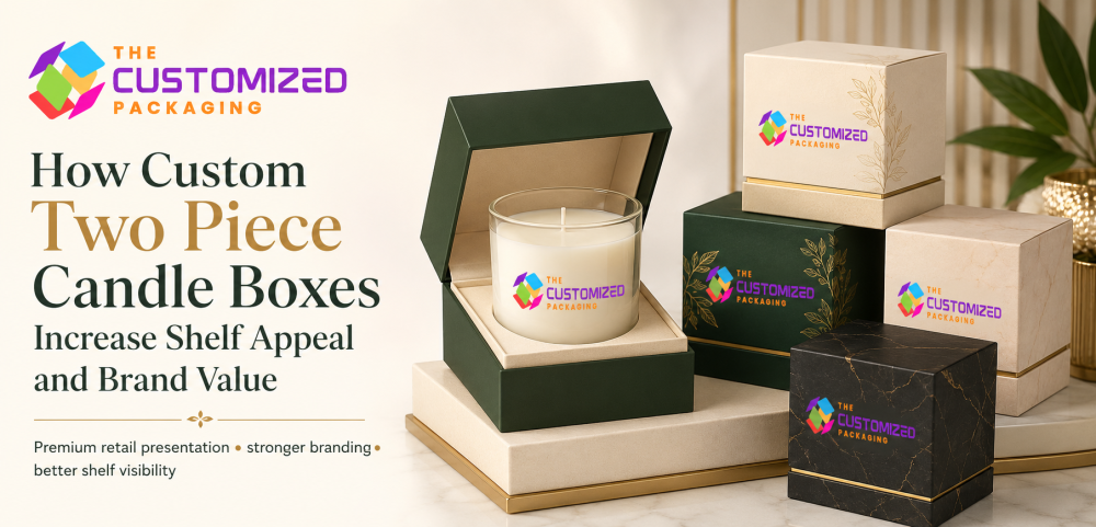
Custom two piece candle boxes can support this approach through their separate lid-and-base construction. The top creates a clear branding surface, while the lower section can introduce contrast, organize the collection and give the package a more defined silhouette.
The structure still needs to be designed for the actual retail environment. Shelf position, viewing distance, product dimensions and neighboring brands all influence what the customer notices.
What Does Shelf Appeal Mean for Candle Packaging?
Shelf appeal is the package’s ability to attract attention, communicate the product and remain recognizable within a retail display.
It is not limited to decoration.
Effective retail candle packaging should help a shopper answer several questions quickly:
-
Which brand is this?
-
What fragrance is inside?
-
Is it part of a collection?
-
What size or type of candle is it?
-
Does the presentation match the expected price level?
-
Can I identify it without opening the box?
The packaging should answer these questions without placing every detail on the main panel.
Shelf appeal also depends on structure. A beautiful box that leans, becomes scratched or separates from its lid will not maintain the intended presentation.
Design for Three Viewing Distances
Retail packaging is examined from more than one distance.
| Viewing distance | What the customer should notice |
|---|---|
| Across the aisle | Overall color block, silhouette and brand family |
| In front of the shelf | Logo, fragrance name and product category |
| In the customer’s hand | Scent notes, size, materials, care details and supporting information |
From a distance, small text and detailed illustrations are difficult to understand. The overall collection color, box proportions and logo system create the first signal.
At closer range, the fragrance and product type become more important. Once the shopper lifts the box, detailed information can appear on the side, base or back panel.
This three-distance approach prevents the front of the package from becoming overcrowded.
Identify the Real Shelf-Facing Panel
The largest panel is not always the one customers will see.
A boutique may display candles upright with the narrow side facing forward. A department store may arrange them in full front-facing rows. Lower shelves can make the top panel more visible, while stacked products may show only the lid edge or side wall.
Before designing the artwork, confirm:
-
How the retailer normally positions similar candles
-
Whether boxes will stand upright or lie flat
-
How many product facings are expected
-
Whether several fragrances will appear together
-
Which panels remain visible when stock is stacked
-
Where price labels or shelf tags will be placed
The main brand and fragrance information should appear on the panel customers are most likely to see.
When several display directions are possible, repeat essential identification on a secondary side or top panel without duplicating the complete design.
Use the Lid and Base as Separate Visual Zones
The two sections of a lid-and-base package do not need to carry the same design.
The lid can introduce the brand and fragrance, while the base provides a secondary color, texture or collection identifier. This creates visual depth without adding more decorative components.
Possible approaches include:
| Lid direction | Base direction | Result |
|---|---|---|
| Neutral lid with small logo | Fragrance-specific base color | Clean collection differentiation |
| Illustrated lid | Solid darker base | Strong visual anchor |
| Kraft lid | Printed interior or colored base | Natural exterior with controlled contrast |
| Dark lid | Light shoulder or base edge | Premium layered presentation |
| One-color lid | Patterned lower section | Restrained front with added side interest |
The contrast should remain visible when several packages stand beside one another. A base color that disappears completely under a deep lid will contribute little to shelf recognition.
Build a Recognizable Fragrance System
A candle collection needs enough consistency to look like one brand and enough variation to help customers identify individual scents.
Keep selected elements fixed:
-
Box dimensions
-
Logo position
-
Typography
-
Product-name placement
-
Net-weight area
-
Barcode location
-
Lid depth
-
Finishing style
Then vary a smaller group of elements:
-
Fragrance color
-
Botanical or ingredient illustration
-
Scent-family symbol
-
Collection name
-
Number or product code
-
Base color
-
Printed sleeve or label
For example, floral scents might use one set of tones, woody fragrances another and fresh or citrus candles a third. The colors should support identification without becoming the only way to distinguish products.
Fragrance names and product codes remain important when shades appear similar or when customers have difficulty differentiating colors.
Create a Strong Collection Block
Several coordinated boxes can attract more attention together than one isolated package.
Retailers often display multiple fragrances from the same candle range side by side. When their proportions, logo positions and typography align, the products form a visual block.
This is sometimes more noticeable than using a different structure for every scent.
Effective candle collection packaging should:
-
Align neatly across several facings
-
Keep fragrance names at the same height
-
Use consistent lid and base proportions
-
Maintain one logo system
-
Allow controlled color variation
-
Look intentional when one or two products are removed
A collection should not collapse visually when the shelf is partially sold through. Each individual box must remain identifiable on its own.
Keep the Main Panel Focused
A front panel usually needs fewer elements than brands initially expect.
A practical order may be:
-
Brand name
-
Fragrance name
-
Candle type or collection
-
Net weight
-
One verified product distinction
Detailed scent notes, candle-care instructions, business information, barcodes and supporting messages can appear on other panels.
Avoid giving equal visual importance to every statement. When the logo, fragrance, wax type, burn time, ingredients, sustainability message, QR code and promotional claim all compete for attention, none of them stands out.
Premium shelf presentation often depends on disciplined spacing rather than more information.
Make the Box Proportional to the Vessel
A small candle inside a tall oversized package may create more shelf presence, but it can also make the product feel misleading once opened.
The carton should be developed around:
-
Vessel diameter
-
Complete height with lid
-
Filled weight
-
Label position
-
Insert thickness
-
Removal clearance
-
Required product information
Right-sizing also affects how many packages can fit across a shelf.
A slightly narrower structure may allow a retailer to display an additional facing. An unnecessarily deep carton can use valuable shelf space without improving the customer experience.
The objective is to create an appropriate presence—not the largest possible package.
Structural Stability Protects the Display
Shelf-ready candle boxes should remain straight and presentable after transportation, stocking and repeated customer handling.
Important structural details include:
-
Firm base construction
Correct lid clearance
Board strength suited to the candle weight
Consistent wrapped or folded corners
A level product platform
Resistance to side-panel bowing
Secure product positioning
The candle should not make the box lean or become top-heavy.
For heavy glass and ceramic vessels, the base and insert should distribute the load evenly. A product that rests against one side may distort the package or create an uneven display.
Test several filled units together rather than reviewing only one sample.
Choose Paperboard or Rigid Construction Deliberately
Two-piece structures can be produced from folding paperboard or thick setup board.
Folding Paperboard
Paperboard lid-and-base cartons can suit smaller candles, boutique retail, events and larger-volume collections. They may require less storage space before assembly and can provide broad surfaces for printing.
Their board grade should still match the candle’s weight.
Rigid Board
Rigid candle boxes create firmer walls, sharper edges and a more substantial feel. They are suitable for premium vessels, limited editions and gift-focused collections.
However, rigid packaging occupies more warehouse space and normally requires separate shipping protection.
The structure should match the product position and retail price rather than assuming that thicker packaging always creates more value.
Use Windows Only When Visibility Helps
A window is not essential for shelf appeal.
It can be useful when the jar, lid, wax color or label contains a feature customers need to see. It may be unnecessary when the exterior artwork already communicates the product clearly.
A window also changes the structure by removing paperboard and possibly adding transparent film.
Before adding one, consider:
-
What part of the candle should be visible
-
Whether store lighting will create glare
-
If the opening reduces lid strength
-
Whether the candle remains aligned behind it
-
How the additional material affects disposal instructions
-
Whether product photography could provide the same information
A small, carefully positioned opening can provide more value than a large generic cutout.
Evaluate Finishes Under Retail Lighting
Foil, embossing, matte surfaces and spot gloss can look different under store lighting than they do on a computer screen.
Metallic foil may reflect brightly under overhead lights. Very subtle debossing may disappear from several feet away. Dark matte surfaces can show dust, fingerprints and shelf rubbing.
Test finishing samples under:
-
Bright overhead lighting
-
Warm boutique lighting
-
Natural daylight
-
Product-photography lighting
-
The colors used in the intended display
A finish should improve recognition or hierarchy. It should not be added simply because it is associated with luxury packaging.
One clear foil mark or tactile logo can be more effective than several effects competing across the lid.
Use the Side and Top Panels Strategically
The front panel attracts attention, but other visible surfaces help customers navigate the collection.
The top may carry a fragrance name for lower-shelf displays. The side can show a scent-family color, product code or short description. The base can hold the barcode and required business information.
Useful secondary-panel content may include:
-
Fragrance family
-
Scent notes
-
Wax or wick information
-
Size
-
Barcode
-
Product code
-
Candle-care link
-
Collection name
-
Verified material details
The same content should not be copied onto every surface.
Each panel should have a defined role based on how the package is displayed and handled.
Protect the Retail Box During Distribution
A presentation carton may lose its shelf impact before reaching the store if it becomes scratched, crushed or marked during shipping.
Retail units should be packed inside an appropriate master shipping case. Dividers or controlled case dimensions can stop individual boxes from rubbing against each other.
Review:
-
Number of units per case
-
Product orientation
-
Pressure on lids
-
Corner protection
-
Movement inside the case
-
Surface rubbing
-
Case labeling
-
Ease of retailer unpacking
Packaging that arrives clean and aligned is easier for retail staff to place directly onto the shelf.
The retail carton and distribution case should therefore be tested as one system.
Define Brand Value More Carefully
Packaging can support brand value, but it does not create it alone.
A coherent package can help a candle brand appear consistent, recognizable and appropriately positioned. It can communicate care, support gifting and make a collection easier to navigate.
However, long-term brand value also depends on:
-
Candle performance
-
Fragrance quality
-
Pricing
-
Retail availability
-
Customer service
-
Product consistency
-
Reviews and reputation
The box should make the brand promise easier to understand. It should not communicate a level of quality the product cannot support.
For this reason, “supports premium positioning” is more accurate than claiming that a box automatically increases product value or sales.
Test Shelf Presence Before a Full Order
A digital mockup normally shows one package in isolation. A retail shelf contains several units, competing brands, shelf labels and changing light.
Create printed samples and review them as a small display.
Test:
-
One box alone
-
Three to six fragrances together
-
The package beside likely competitors
-
Front-facing and side-facing positions
-
Upper, middle and lower shelf heights
-
Bright and warm lighting
-
Partially sold-through displays
Ask several people to identify the brand, fragrance and candle type from different distances.
The objective is not to ask whether the box looks attractive. It is to determine whether the information is easy to notice and understand.
Measure Retail Performance Without Overclaiming
A packaging update should be evaluated with more than internal opinions.
Useful indicators may include:
-
Retailer feedback
-
Sell-through by store or display
-
Restocking ease
-
Frequency of damaged cartons
-
Customer questions
-
Product-review comments
-
Recognition of individual fragrances
-
Performance of old and new packaging in comparable locations
Packaging should not receive full credit for every improvement. Promotions, pricing, shelf position, stock levels and seasonality can also influence sales.
Comparing similar stores or controlled packaging versions can provide more useful information than assuming that a redesign caused every change.
Planning a Wholesale Production Run
The price of wholesale candle packaging depends on the dimensions, structure, board type, lid depth, printing, finishes, insert, artwork variations and quantity.
Before requesting pricing, prepare:
-
Finished vessel dimensions
-
Candle weight
-
Required box style
-
Preferred shelf orientation
-
Lid and base color system
-
Number of fragrances
-
Quantity for each design
-
Insert requirements
-
Printing and finishing details
-
Retail launch date
-
Delivery destination
Most custom packaging projects begin at 100 units. Fragrances using separate printed artwork should be listed individually rather than combined into one total quantity.
Why Choose The Customized Packaging?
The Customized Packaging develops lid and base candle boxes for retail collections, boutiques, gift stores, spas, home-fragrance brands and ecommerce businesses entering physical retail.
Projects can include folding paperboard or rigid construction, custom lid depths, contrasting bases, fitted supports, fragrance-based artwork, printed interiors and selected premium finishes.
The box can be designed around the candle vessel, expected display position and number of fragrance variations. A physical sample should be reviewed with the actual product before wholesale manufacturing.
Standard production generally takes 8–12 business days after structural and artwork approval, with rush service available for eligible projects.
Frequently Asked Questions
What gives a candle box strong shelf appeal?
Clear brand and fragrance identification, stable construction, appropriate proportions, consistent collection design and readable shelf-facing panels are more important than excessive decoration.
Should every candle fragrance use a different box design?
Not completely. The structure, logo placement and information hierarchy can remain consistent while selected colors, illustrations or scent identifiers change.
Are rigid boxes always better for retail candles?
No. Rigid structures suit premium and gift-focused products, while well-designed folding paperboard boxes can provide strong shelf presentation with lower storage and production demands.
Which panel should carry the main branding?
Use the panel customers are most likely to see in the intended display. This may be the front, narrow side or top depending on the retailer’s shelf arrangement.
Do brighter colors create better shelf appeal?
Not necessarily. Contrast, clarity and collection consistency often matter more than brightness. A restrained package can stand out when surrounding products are visually busy.
Can packaging prove that a candle is high quality?
No. Packaging can communicate the intended position and present the product professionally, but candle performance, fragrance and customer experience must support that message.
Design for the Complete Shelf, Not One Isolated Box
Retail presentation should be planned as a system.
The lid creates the main visual field. The base adds structure or contrast. Secondary panels help customers navigate the collection, while consistent dimensions allow several fragrances to form one recognizable display.
When these parts work together, two-piece candle packaging can make a product easier to notice, understand and remember without depending on repeated claims, excessive finishes or an oversized carton.